🧬 Python's pyCirclize as a genome visualisation tool
Using the pyCirclize Python library to generate a circular genome plot
Was recently essing around with some bacterial genomes and I wanted a neat way to visualise a plasmid’s genomic layout. Found this cool tool called pyCirclize. It’s a Python library built on Matplotlib, designed for creating beautiful circular visualisations, including Circos plots which are perfect for genomics. You can find more about it on its GitHub repository or its documentation page.
I decided to give it a whirl for one of the plasmids from my K. pneumoniae isolate, and here’s what pyCirclize helped me come out with:
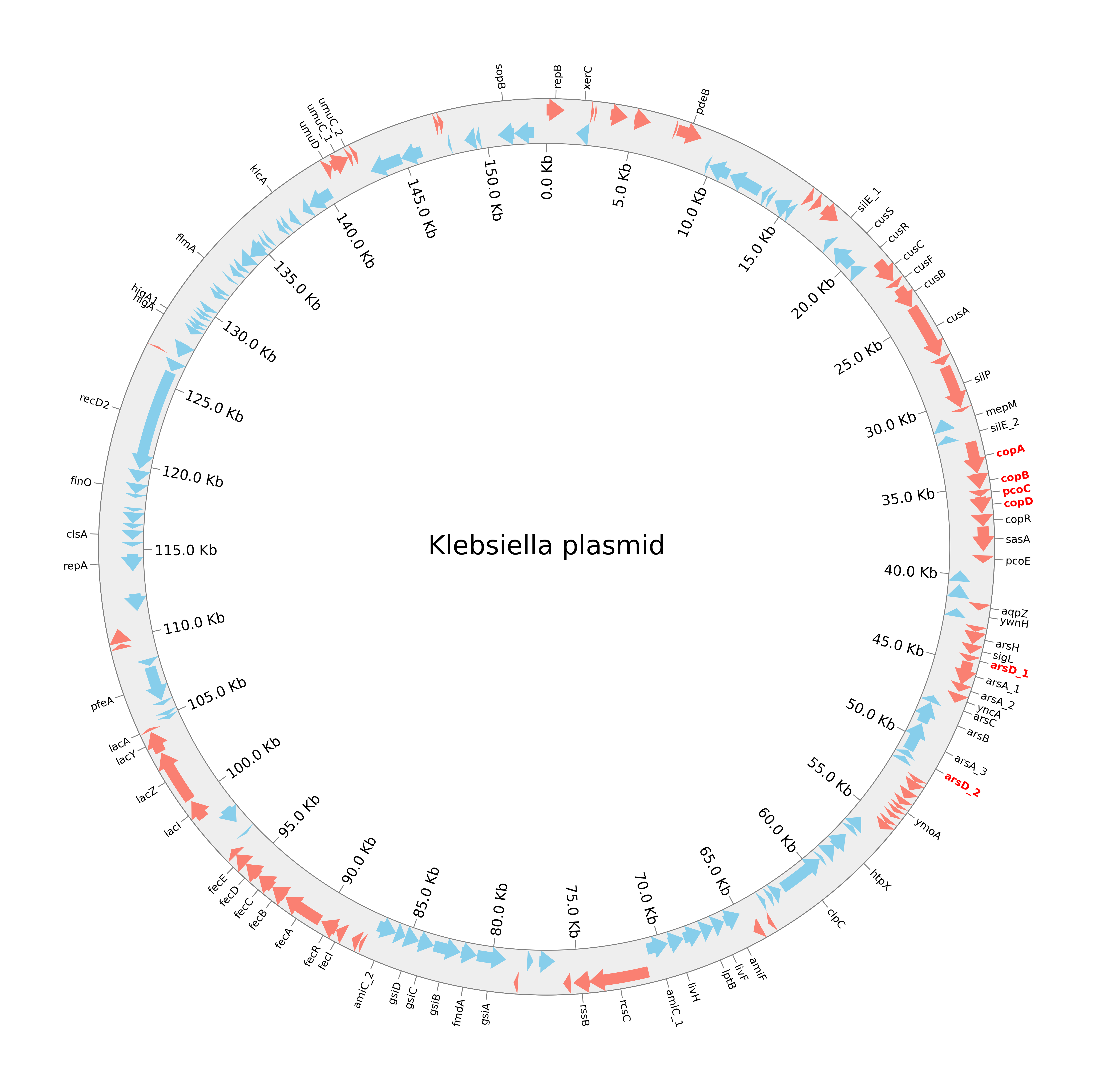
Pretty neat, right? It clearly shows the coding sequences (CDS) on both strands, labels for key genes, and highlights the important resistance genes.
🐍 The Python Script
First, we import the necessary parts of pyCirclize and load our GFF file for the plasmid. This GFF file (KP9_plasm1_isolates.gff) contains all the annotation data like gene locations, strands, and product descriptions from an interesting plasmid we sequenced recently.
1
2
3
4
from pyCirclize import Circos
from pyCirclize.parser import Gff

gff = Gff("KP9_plasm1_isolates.gff")
We create a Circos object, defining a single sector for our plasmid, with its size based on the GFF range, and then we add a track for CDs. A track is like a lane on the circular plot where we can display data.
1
2
3
4
5
6
7
circos = Circos(sectors={gff.name: gff.range_size})
circos.text("Klebsiella plasmid", size=15)
sector = circos.sectors[0] # this gets the first (and only :))) sector

# adds the CDs track, define the inner and outer radius as well as color
cds_track = sector.add_track((90, 100))
cds_track.axis(fc="#EEEEEE", ec="none")
We then extract CDS features from the GFF based on their strand (forward or reverse) and plot them as arrows on our track. Notice how the CDs track had 10px worth of thickness, we’ll limit the arrows to 5px of width for each fwd and rev track individually.
1
2
3
4
5
6
7
# fwd
f_cds_feats = gff.extract_features("CDS", target_strand=1)
cds_track.genomic_features(f_cds_feats, plotstyle="arrow", r_lim=(95, 100), fc="salmon")

# rev
r_cds_feats = gff.extract_features("CDS", target_strand=-1)
cds_track.genomic_features(r_cds_feats, plotstyle="arrow", r_lim=(90, 95), fc="skyblue")
Now we extract and plot the gene labels. This part is where most of the magic happens. The script iterates through the CDS features to:
- Extract gene names (from the “gene” qualifier in the GFF).
- Filter out what Prodigal identified as “hypothetical protein” in the GFF, to keep the plot clean.
- Truncate very long labels.
- Separately identify genes associated with “resistance” (based on the “product” qualifier in the GFF) so they can be highlighted.
The gene identifier and highlighter took me the most to get right. It’s probably not the best way of doing it but that’s what my dummy Python brain could come up with at 4AM on a workday, lol.
1
2
3
4
5
6
7
8
9
10
11
12
13
14
15
16
17
18
19
20
21
22
23
24
25
26
27
28
29
30
31
32
33
34
35
36
37
38
39
40
41
42
# for xtracting general gene labels (non-resistance, non-hypothetical)
pos_list, labels = [], []
for feat in gff.extract_features("CDS"):
    start, end = int(str(feat.location.end)), int(str(feat.location.start))
    pos = (start + end) / 2
    label = feat.qualifiers.get("gene", [""])[0]
    resist_product_info = feat.qualifiers.get("product", [""])[0]
    if label == "" or label.startswith("hypothetical"):
        continue
    if "resistance" in resist_product_info.lower(): # this checks product info for resistance
        continue # skip resistance genes here, as they are plotted separately
    if len(label) > 20:
        label = label[:20] + "..."
    labels.append(label)
    pos_list.append(pos)

# extracts resistance gene labels
res_pos_list, res_labels = [], []
for feat in gff.extract_features("CDS"):
    start, end = int(str(feat.location.end)), int(str(feat.location.start))
    pos = (start + end) / 2
    label_r = feat.qualifiers.get("gene", [""])[0]
    resist_product_info = feat.qualifiers.get("product", [""])[0]
    if label_r == "" or label_r.startswith("hypothetical"):
        continue
    if "resistance" not in resist_product_info.lower():
        continue
    res_labels.append(label_r)
    res_pos_list.append(pos)

# plot for general gene labels
cds_track.xticks(
    pos_list, labels, label_orientation="vertical",
    show_bottom_line=True, label_size=6, line_kws=dict(ec="grey"),
)

# Plot resistance gene labels in RED
cds_track.xticks(
    res_pos_list, res_labels, label_orientation="vertical",
    show_bottom_line=True, label_size=6, line_kws=dict(ec="grey"),
    text_kws=dict(color="red", fontweight=600) # makes the font thicker, "bold" didn't work
)
Finally, to give a sense of scale, I add tick marks at regular intervals (e.g., every 5kb) around the plasmid, aaand voila, all is left to do is saving the figure.
1
2
3
4
5
6
7
8
9
10
11
# this plots "ticks" & intervals on inner position for scale
cds_track.xticks_by_interval(
    interval=5000,
    outer=False,   # to place ticks on the inner side of the track
    show_bottom_line=True,
    label_formatter=lambda v: f"{v/ 1000:.1f} Kb", # format labels as 'X.Y Kb'
    label_orientation="vertical",
    line_kws=dict(ec="grey"),
)

fig = circos.savefig("Plasmid.png", dpi = 600)
Final thoughts
I found pyCirclize to be quite intuitive for this kind of prokaryotic genome visualisation. Once you get the hang of sectors and tracks, plotting features from a GFF file is pretty straightforward. The ability to customize colors, labels, and styles directly in Python gives you a lot of control, which is great for generating figures for publications or, well, blog posts. It definitely beats trying to draw something like this manually. 😅
This was a fun little Python-based plotting project and a nice way to visualise the genomic landscape of that interesting plasmid.