🧬 Sarcoma RNA-Seq DGE tryharding
RNA-Seq differential gene expression analysis from sarcoma patients
RNA-Seq analysis was performed to identify differentially expressed genes (DEGs) between 12 sarcoma tissue samples and 2 controls. The amount of physical samples was limited, especially the amount of control samples we had. To add to that problem, the two control samples we had available were different in tissue type too - one was mostly adipose and the other muscular tissue. Decided to give it a go and try my best to make some sort of DGE analysis out of the available data, just to learn some of that RNA-seq goodness that everybody is bragging about. Here goes…
💧 Extracting & Sequencing
- 1. RNA Extraction
- Total RNA was extracted using QIAGEN's RNeasy Fibrous Tissue Kit from 40-60 mg of tumoral tissue preserved in RNAlater. After extraction, we used the Invitrogen Qubit RNA High Sensitivity Kit to assess the RNA concentration. The yield was approx. 20-60 ng/µL</b>.
- 2. Library Preparation
- Library preparation was performed using TruSight RNA Pan-Cancer Set, guided by the manufacturer's protocol, and loading up the cartridge into our Illumina miniSeq Sequencing System. Final goal was to be able to use the data analysis offered by Illumina's BaseSpace cloud-based environment, but I wanted to also try my hand at some manual DGE.
🧬 Data Analysis
1. Quality control & Trimming
QC and adapter trimming were done using FastQC and Trimmomatic. Quality score was pretty good, the last basepair of each FASTQ was pretty low so I decided to crop it out, followed by a MAXINFO which is “an adaptive quality trimmer which balances read length and error rate to maximise the value of each read”.
1
2
3
4
5
6
7
8
9
10
11
12
13
14
15
16
fastqc *.fastq.gz

for s in {1..8}; do
for r in {1..2}; do
java -jar trimmomatic/trimmomatic-0.39.jar PE -threads 48 \
-basein P${s}_S${s}_L001_R${r}_001.fastq.gz \
-baseout P${s}_${r}.fastq.gz \
CROP:75; done; done

for s in {1..8}; do
for r in {1..2}; do
java -jar trimmomatic/trimmomatic-0.39.jar PE -threads 48 \
-basein P${s}_S${s}_L001_R${r}_001.fastq.gz \
-baseout P${s}_${r}.fastq.gz \
MAXINFO:75:0.5; done; done
2. Alignment
Reads were aligned to the reference genome GRCh38/hg38 using HISAT2. I tried following the differential expression analysis instructions found in the StringTie manual but got stopped in my tracks after reading that Ballgown was not really designed for gene-level differential expression analysis – it was written specifically to do isoform-level DE. Using DESeq2 with FeatureCounts is a much better-supported operation if your main interests are in gene-level DE. Count-based models like those in DESeq2 are totally appropriate for gene-level DE (whereas Stringtie and Ballgown are tools for when the count-based models don’t work). So Hisat2 -> FeatureCounts -> DESeq2 would be a great workflow if you don’t need isoform-level results. (Thanks to @Alyssa Frazee on Bioconductor Support for this info)
1
2
3
4
5
for s in {1..8}; do
hisat2 -q -p 26 --rna-strandness RF \
-x grch38_snp_tran/genome_snp_tran -1 Fastq/P${s}_1.fastq.gz \
-2 Fastq/P${s}_2.fastq.gz --dta | samtools sort -o P${s}.bam
done
3. Gene Quantification 📊
And so I used FeatureCounts to count how many reads mapped to each gene. This step generates a matrix of counts, which is essential for DGE analysis.
1
featureCounts -S 2 -p -T 48 -a Homo_sapiens.GRCh38.111.gtf -o FeatureCountsFinal.txt *.bam
4. Differential Expression Analysis
Following the gene quantification step, the next crucial step was to identify which genes showed significant differences in expression between the sarcoma samples and the normal control tissues. For this task, I opted for DESeq2, a well-regarded R package specifically designed for robust analysis of count-based RNA-seq data.
To really dig into what was happening with gene expression in these sarcoma samples, I didn’t just look at things one way. I ran the DESeq2 analysis to cover a few key comparisons:
- All soft tissue tumors versus control samples.
- Myosarcomas (a specific subtype we were interested in) versus control.
- Myosarcomas versus the other types of soft tissue tumors in the dataset, to see what makes them distinct from each other.
While the overall DESeq2 workflow (getting the data ready, running the stats, making plots) was pretty much the same for all of these, this post will mainly walk through the first analysis, soft tumors vs controls, to show you the general steps and what the example plots like volcano plots and heatmaps look like. The cool part is that the same ideas and types of visualizations helped make sense of the other comparisons too!
First things first, I needed to load my data into R. This involved reading the gene count matrix and a separate file containing the phenotypes. This phenotype file is key because it tells DESeq2 which samples belong to which group (e.g., “tumor” or “normal”). The design = ~tissue formula is fundamental since it instructs DESeq2 to look for gene expression changes that are associated with the different tissue types in my phenotype table.
1
2
3
4
5
6
7
8
9
10
11
12
13
14
15
16
17
18
19
20
21
22
23
24
25
26
27
28
29
30
31

library(DESeq2)

fcf <- read.csv("FeatureCountsFinal.csv")
phen <- read.csv("phenotypes.csv")

# ensure sample names in counts match metadata
all(colnames(fcf) %in% rownames(phen))
all(colnames(fcf) == rownames(phen))

# '~tissue' tells DESeq2 to model gene expression based on the 'tissue' column
tissue_dds2x <- DESeqDataSetFromMatrix(countData = fcf,
                                     colData = phen,
                                     design = ~tissue)

# remove genes with very low counts (sum of counts across all samples < 10)
keep <- rowSums(counts(tissue_dds2x)) >= 10
tissue_dds2x <- tissue_dds2x[keep,]

# setting the reference control values
tissue_dds2x$tissue <- relevel(tissue_dds2x$tissue, ref = "normal")

# do DGE and writing to CSV, get a summary of the results
degtissue <- DESeq(tissue_dds2x)
rezultate_tissue <- results(degtissue)
write.csv(rezultate_tissue,"DEG_NormalVSTumor.csv")
summary(rezultate_tissue)

# specifying alpha for independent filtering (alpha is the significance cutoff used for optimizing the number of DEGs)
rezultate_tissue005 <- results(degtissue, alpha = 0.05)
summary(rezultate_tissue005)
The results table from DESeq2 contains lots of useful information (log2 fold changes, p-values, adjusted p-values), but the gene identifiers are often Ensembl IDs. To make these more interpretable, I mapped them to common gene symbols using the org.Hs.eg.db annotation database.
1
2
3
4
5
6
7
8
BiocManager::install("org.Hs.eg.db")
library(org.Hs.eg.db)

# transform rez in dataframe
rezultate_tissue005_df <- as.data.frame(rezultate_tissue005)

rezultate_tissue005_df$Symbol <- mapIds(org.Hs.eg.db, rownames(rezultate_tissue005_df), keytype = "ENSEMBL", column = "SYMBOL")
write.csv(rezultate_tissue005_df, "DEG_NormalVsTumor.csv")
Before diving deep into the gene lists, it’s good practice to run some diagnostic plots to get a feel for the data and the analysis, like PCA plotting, dispersion analysis, and size factor estimation. With my super small data set, however, these weren’t much help.
1
2
3
4
5
6
7
8
9
# PCA Plotting
vsd <- vst(degtissue, blind = FALSE)
plotPCA(vsd, intgroup = "tissue")

# size factor estimation
sizeFactors(degtissue)

# dispersion analysis
plotDispEsts(degtissue)
5. Visualising and interpreting the DEGs 📈
With the statistical analysis complete, the next step was to visualize these results to identify key genes and patterns. I went ahead and created volcano plots and heatmaps for my data set.
1
2
3
4
5
6
7
8
9
10
11
12
13
14
15
16
17
18
19
20
21
22
23
24
25
26
27
28
29
30
31
32
33
34
35
36
37
38
39
40
41
42
43
44
45
46
47
48
49
50
51
52
53
54
55
56
57
58
59
60
61
62
63
64
65
66
67
68
69
70
71
72
73
74
75
76
77
78
79
80
81
82
83
# dplyr, ggplot install
install.packages("dplyr")
install.packages("ggplot2")
install.packages("ggrepel")
BiocManager::install("ComplexHeatmap")
library(dplyr)
library(ggplot2)
library(ggrepel)
library(ComplexHeatmap)


# VolcanoPlots
vol <- rezultate_tissue005_df %>%
  filter(!is.na(padj)) %>%
  filter(!is.na(Symbol))

vol <- vol %>%
  mutate(
    Regulation = case_when(
      padj < 0.05 & log2FoldChange > 5 ~ "Upregulated",
      padj < 0.05 & log2FoldChange < -5 ~ "Downregulated",
      TRUE ~ "Unregulated"
    )
  )

bestNVTup <- vol %>%
  filter(Regulation == "Upregulated") %>%
  arrange(padj) %>%
  head(15)

bestNVTdown <- vol %>%
  filter(Regulation == "Downregulated") %>%
  arrange(padj) %>%
  head(10)

ggplot(vol, aes(x = log2FoldChange, y = -log10(padj), color = Regulation)) +
  geom_point(size = 2) +
  geom_text_repel(data = bestNVTup, aes(label = Symbol),
                  box.padding = 0.8, point.padding = 0.1, fontface = "bold", max.overlaps=20) +
  geom_text_repel(data = bestNVTdown, aes(label = Symbol),
                  box.padding = 0.5, point.padding = 0.1, fontface = "bold", max.overlaps=20) +
  labs(title = "Soft tissue tumors versus Control",
       x = "log2 Fold Change",
       y = "-log10 Adjusted p-value",
       color = "Regulation") +
  scale_color_manual(values = c("Unregulated" = "black",
                                "Downregulated" = "blue",
                                "Upregulated" = "red"),
                     labels = c("Downregulated", "None", "Upregulated"),
                     name = "Differential expression") +
  theme_minimal() +
  theme(legend.position = "right",
        legend.title = element_text(face = "bold"),
        legend.text = element_text(size = 10),
        plot.title = element_text(size = 20, face = "bold", hjust = 0.5)) +
  geom_hline(yintercept = -log10(0.05), linetype = "dashed", color = "darkred", linewidth=0.5) +
  geom_vline(xintercept = c(-5, 5), linetype = "dashed", color = "darkred", linewidth=0.5)


# HeatMaps
toptissuegenes <- rezultate_tissue005_df %>%
  arrange(padj)%>%
  head(50)

normtissuegenes <- counts(degtissue, normalized=T)[rownames(toptissuegenes),]
head(normtissuegenes, 5)

ztissuegenes <- t(apply(normtissuegenes,1,scale))
head(ztissuegenes, 5)

colnames(ztissuegenes) <- rownames(phen)

Heatmap(ztissuegenes,
        cluster_rows=T,
        cluster_columns=T,
        column_labels=colnames(ztissuegenes),
        row_labels=toptissuegenes$Symbol,
        name="Row Z Score",
        column_title = "Expression and clustering of top 50 differentially expressed genes

        Soft tissue tumors versus Control",
        column_title_gp = gpar(fontface="bold")
        )
A. The VolcanoPlot…
…is a fantastic way to visualize differentially expressed genes. It plots the statistical significance (-log10 adjusted p-value) against the magnitude of change (log2 fold change). Genes that are highly significant and have large fold changes will appear at the top-left (downregulated) or top-right (upregulated) of the plot. Dotted lines typically indicate the chosen thresholds for statistical significance (e.g., adjusted p-value < 0.05) and biological significance (e.g., log2 fold change > 5 or < -5, which are very stringent thresholds I used to focus on strong effects).
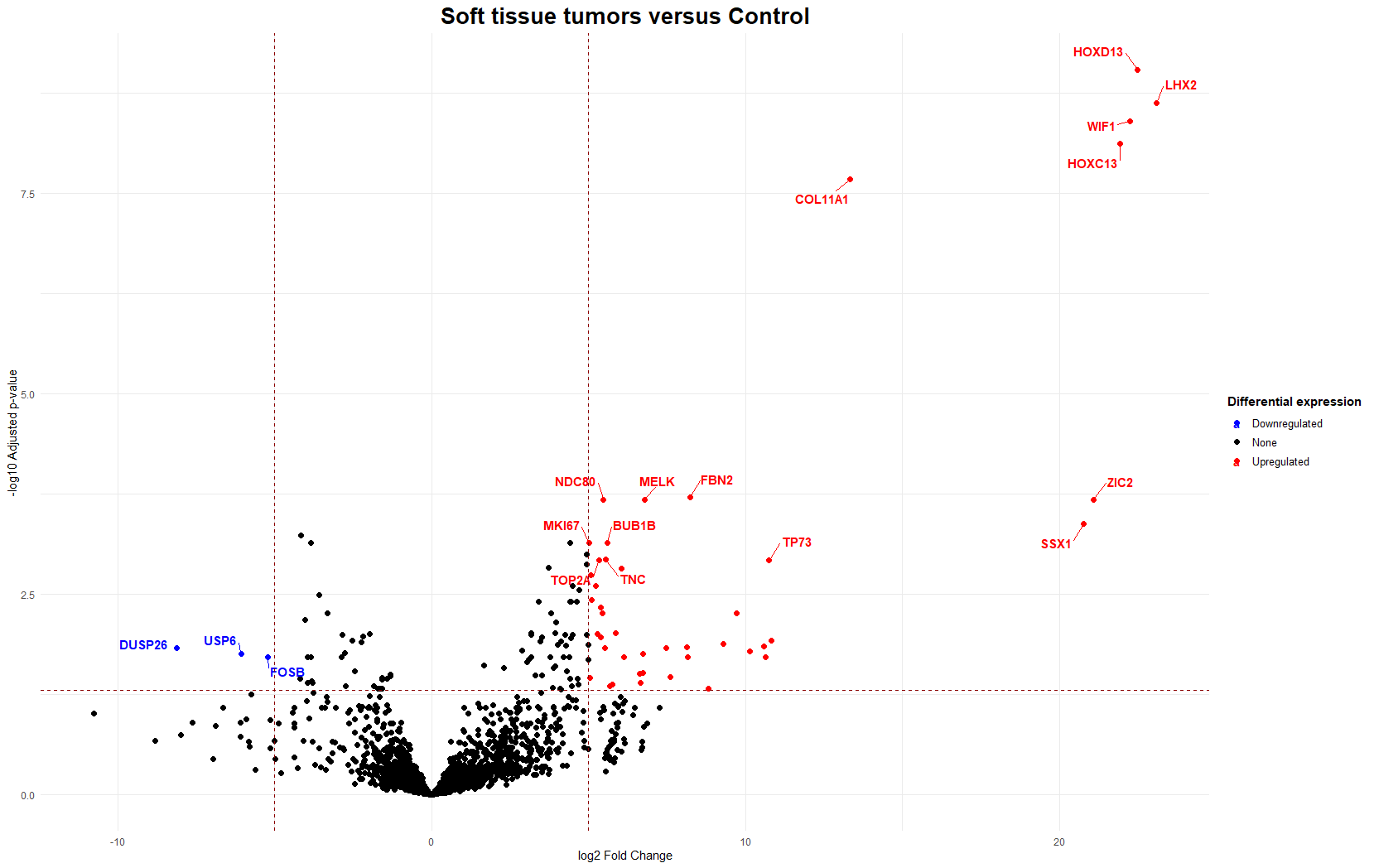
For instance, in the analysis comparing soft tissue tumors against control samples, genes like HOXD13 and MKI67 appeared as upregulated in the tumor samples. This is clinically relevant as HOX genes can promote proliferation and invasion, as well as MKI67 being a well-known proliferation marker.
B. HeatMaps…
…provide a matrix view of gene expression levels, where colors represent expression intensity (e.g., red for high, blue for low). They are great for visualizing patterns across many genes and samples simultaneously and often reveal how samples and genes cluster based on expression similarity. For this experiment, given the low sample size, I could easily display the top 50 most significantly differentially expressed genes without crowding the image too much.
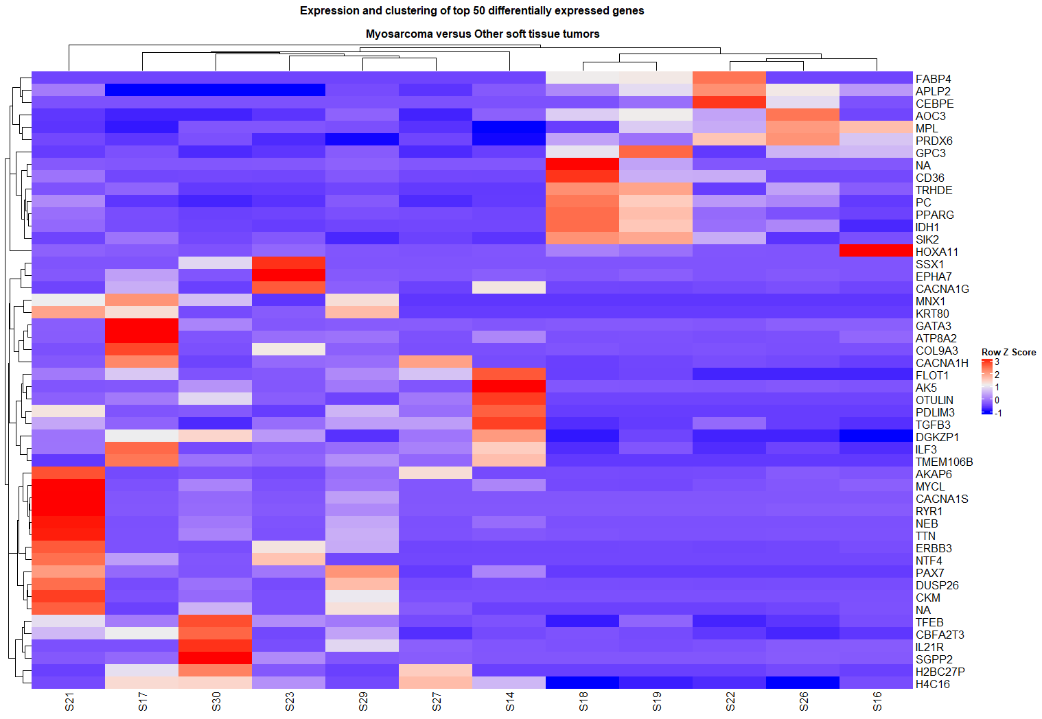
When comparing myosarcomas to other soft tissue tumors, a heatmap of the top 50 differentially expressed genes clearly showed a cluster of myosarcoma samples with distinct expression patterns, such as lower expression of the H4C16 gene compared to other tumor types.
Publishing in the Romanian Journal of Laboratory Medicine
This whole sarcoma RNA-seq exploration also led to a presentation at the 2024 AMLR Conference (The Romanian Association of Laboratory Medicine) and got published in the Romanian Journal of Laboratory Medicine!
The combination of manual DESeq2 analysis, the use of Illumina Dragen RNA pipeline, and a small detour with an interesting tool called BulkDGD resulted in a nice little comparison of all these approaches.
BulkDGD was a bit of a wild ride! The idea is cool - it uses a generative model to figure out how samples are different and for DGE. It was genuinely fun to tinker with. While the generative model concept was interesting, BulkDGD wasn’t the best fit for this small dataset, as its own model didn’t include many of the genes found in the TruSight Panel. Playing with its generative approach was great experience. In the end, using these different tools together helped me build a better understanding on how to really use the data and what other possibilities one can find out there.
You can read the abstract here, on page 19.
Concluding Thoughts: The Joy and Jitters of RNA-Seq 🎢
Well, this was quite an experience! I have to say, I really enjoyed playing with all the data. Making things like volcano plots and heatmaps to actually see what the genes are doing is super fun.
Now, because I didn’t have a lot of samples (especially good control ones), the results for this particular study were a bit “meh” – not super clear or strong. That was a bit of a letdown. But, it was really great practice for doing this whole kind of analysis from start to finish!
The coolest part for me is just how much you can do with this RNA-Seq stuff. The ability to systematically compare gene expression across different biological states – whether it’s various tumor subtypes, healthy versus diseased tissue, or samples before and after a specific intervention – is incredibly powerful. It makes you think about all the different questions you could ask and the biological puzzles you could start to piece together.