🔬 DGE in osteoarthritis patients using qPCR & RQdeltaCT
Relative quantification of gene expression in an osteoarthritis dataset
My colleague Mădălina was working on an interesting osteoarthritis project - she was looking to perform relative quantification of gene expression for a handful of genes that were amplified in triplicate using the Bio-Rad CFX Real-Time PCR system, from 28 osteoarthritis and 3 control samples, and an average Ct was calculated for each sample. She asked if I could join in to help with the data analysis using R.
This post walks through the main steps we took, primarily leveraging a neat R package called RQdeltaCT which is designed to streamline this kind of analysis. I followed the instruction found on CRAN.
🛠️ Setting up the environment
First things first, I needed to get R ready with the necessary packages and load the data. I started by ensuring all the required packages were installed. The star of the show was RQdeltaCT along tidyverse for general data manipulation. Mădălina merged all the raw Ct data into a CSV file named data_Ct_long.csv which I then loaded in the environment using the read_Ct_long() function after editing it with the required format.
1
2
3
4
5
6
7
8
9
10
11
12
13
14
15
16
17
18
19
20
21
setwd("S:/BioMol/RQdeltaCT")
install.packages("remotes")
remotes::install_github("Donadelnal/RQdeltaCT")
library(RQdeltaCT)
library(tidyverse)
path <- "data_Ct_long.csv"

# load the Ct data
data.Ct <- read_Ct_long(path = path,
                        sep = ",",           # CSV separator
                        dec = ".",           # Decimal character
                        skip = 0,            # Lines to skip at the beginning
                        add.column.Flag = TRUE, # Add a flag column if not present
                        column.Sample = 2,   # Column index for Sample names
                        column.Gene = 3,     # Column index for Gene names
                        column.Ct = 4,       # Column index for Ct values
                        column.Group = 1,    # Column index for Group information
                        column.Flag = 5)     # Column index for Flag information


str(data.Ct)
⚙️ Quality control & data preparation
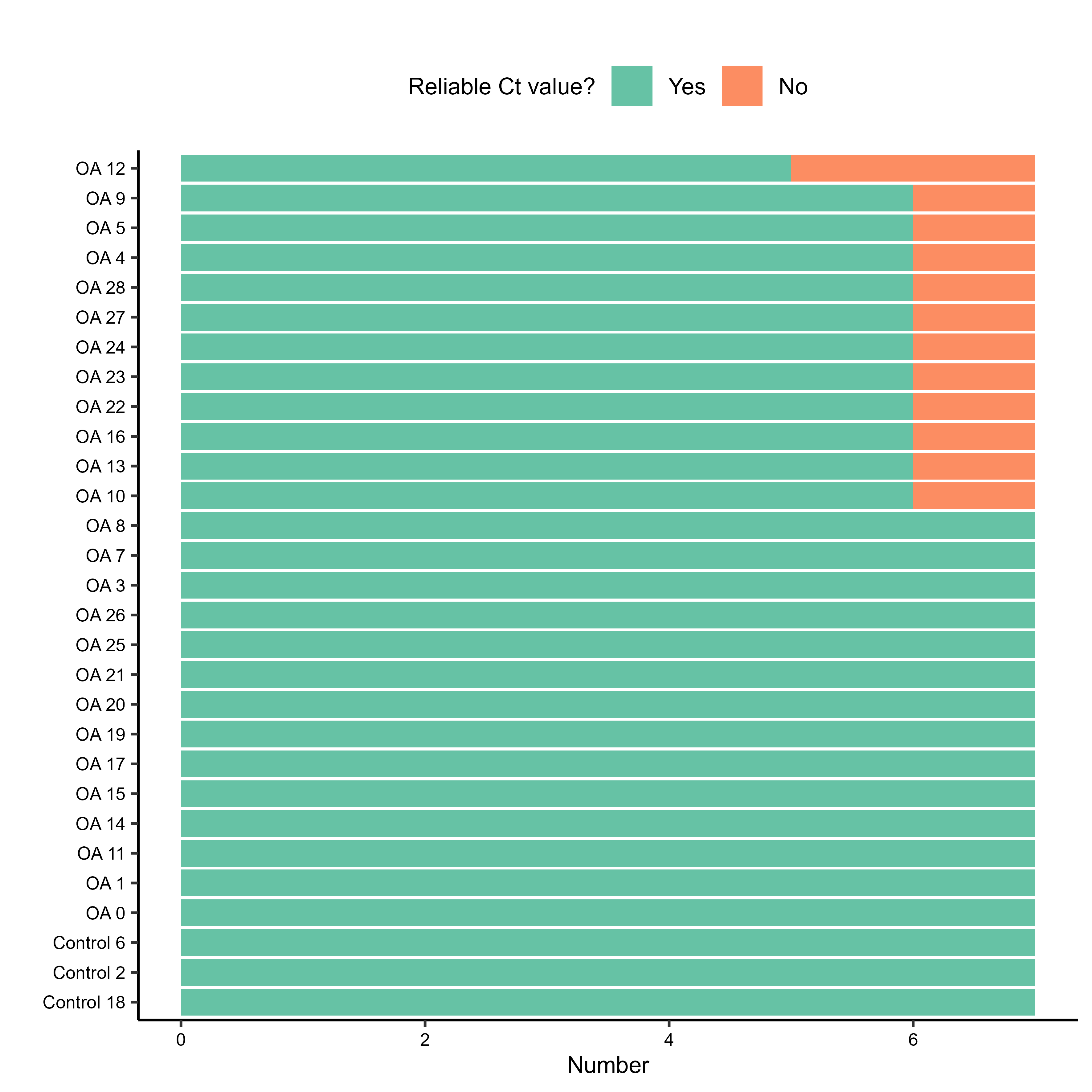
Before diving into quantification, it’s crucial to perform some quality control on the Ct values. The RQdeltaCT package provides functions to quickly visualise the raw Ct values, which can help spot outliers or issues. I generated barplots for Ct values per sample and per gene. These also save as TIFF files if save.to.tiff = TRUE.
1
2
3
4
5
6
7
8
9
10
sample.Ct.control <- control_Ct_barplot_sample(data = data.Ct,
                                             flag.Ct = "Undetermined", # How undetermined values are flagged
                                             maxCt = 38,               # Max Ct value considered reliable
                                             save.to.tiff = TRUE)


gene.Ct.control <- control_Ct_barplot_gene(data = data.Ct,
                                           flag.Ct = "Undetermined",
                                           maxCt = 38,
                                           save.to.tiff = TRUE)
The plots were showing reliable enough results to keep going forward with all the samples/genes. There were some outliers due to average Ct being slightly higher than 38, so we decided to raise that bar to 38.5 due to really trusting our CFX system.
 QC barplot for samples
🎨 Heatmap attempt and filtering

I then tried to generate a heatmap of the raw Ct values using the control_heatmap() function. This initially failed with a “breaks are not unique” error. The RQdeltaCT manual notes: “The control_heatmap() works only if various numbers of replicates are in the data, otherwise error will appear because the inherited pheatmap() function can not deal with the situation where all values are equal.” This suggested the raw data might not have enough variability for this specific heatmap function as initially configured.
1
2
3
4
5
6
7
8
9
10
11
library(pheatmap)
colors <- c("#4575B4","#FFFFBF","#C32B23")
control_heatmap(data.Ct,
                sel.Gene = "all",
                colors = colors,
                show.colnames = TRUE,
                show.rownames = TRUE,
                fontsize = 9,
                fontsize.row = 9,
                angle.col = 45,
                save.to.tiff = TRUE)
Next, I looked for samples or genes with a high fraction of unreliable Ct values.
1
2
3
4
5
6
7
8
9
# finding samples with >50% unreliable Ct values
low.quality.samples <- filter(sample.Ct.control[[2]], Not.reliable.fraction > 0.5)$Sample
low.quality.samples <- as.vector(low.quality.samples)
print(paste("Low quality samples to remove:", low.quality.samples))

# finding genes with >50% unreliable Ct values in any given group
low.quality.genes <- filter(gene.Ct.control[[2]], Not.reliable.fraction > 0.5)$Gene
low.quality.genes <- unique(as.vector(low.quality.genes))
print(paste("Low quality genes to remove:", low.quality.genes))
In this case, both low.quality.samples and low.quality.genes lists were empty, meaning all samples and genes passed this particular QC check.
We then explored filtering the data using filter_Ct primarily to handle values flagged as “Undetermined” or those exceeding maxCt (which I had previously raised to 38.5 due to some genes having average Cts of a hair higher than 38).
1
2
3
4
5
6
7
8
9
data.CtF <- filter_Ct(data = data.Ct,
                      flag.Ct = "Undetermined",
                      maxCt = 38.5,
                      flag = c("Undetermined"),
                      remove.Gene = low.quality.genes,
                      remove.Sample = low.quality.samples)

dim(data.Ct)
dim(data.CtF)
The dimensions were both 203, so no entries were removed. Neat. Next step was preparing data for ddCt analysis, using the make_Ct_ready function.
1
2
data.Ct.ready <- make_Ct_ready(data = data.CtF,
                                imput.by.mean.within.groups = FALSE)
🎫 Finding a reliable reference gene, normalising, further QC
A stable reference (housekeeping) gene is essential for normalisation. We used the ctrlGene package to help identify the best one from our candidates (ACTB1, GUSB2).
1
2
3
4
5
6
7
8
library(ctrlGene)
ref_gene_analysis <- find_ref_gene(data = data.CtF.ready,
                                   groups = c("Osteoarthritis","Control"),
                                   candidates = c("ACTB1", "GUSB2"),
                                   norm.finder.score = TRUE,
                                   genorm.score = TRUE,
                                   save.to.tiff = TRUE)
print(ref_gene_analysis[[2]]) # to show stability scores table
The analysis (including NormFinder and geNorm scores) suggested ACTB1 had good characteristics (like low variance) to be a reliable reference gene for this dataset. So, ACTB1 became our reference, and I had to use it to normalise the rest. For the dCt method, transform should be set to TRUE to tansform the dCt values. For the ddCt method, transform should be set to FALSE to avoid dCt values transformation that is performed later by the consecutive RQ_ddCt() function, which I used later.
1
2
3
4
5
# ddCt normalisation
data.dCt <- delta_Ct(data = data.CtF.ready,
                     normalise = TRUE,
                     ref = "ACTB1",
                     transform = FALSE)
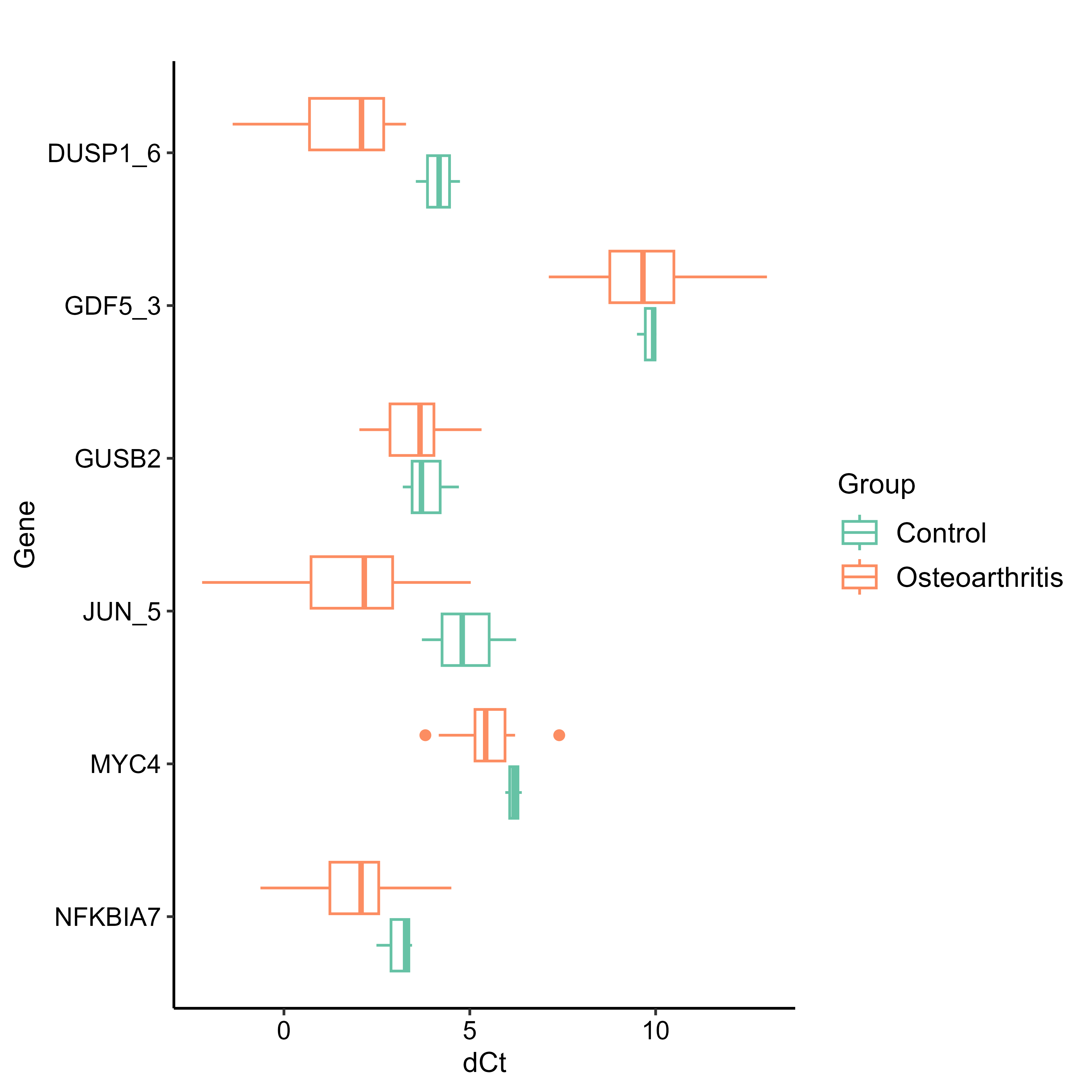
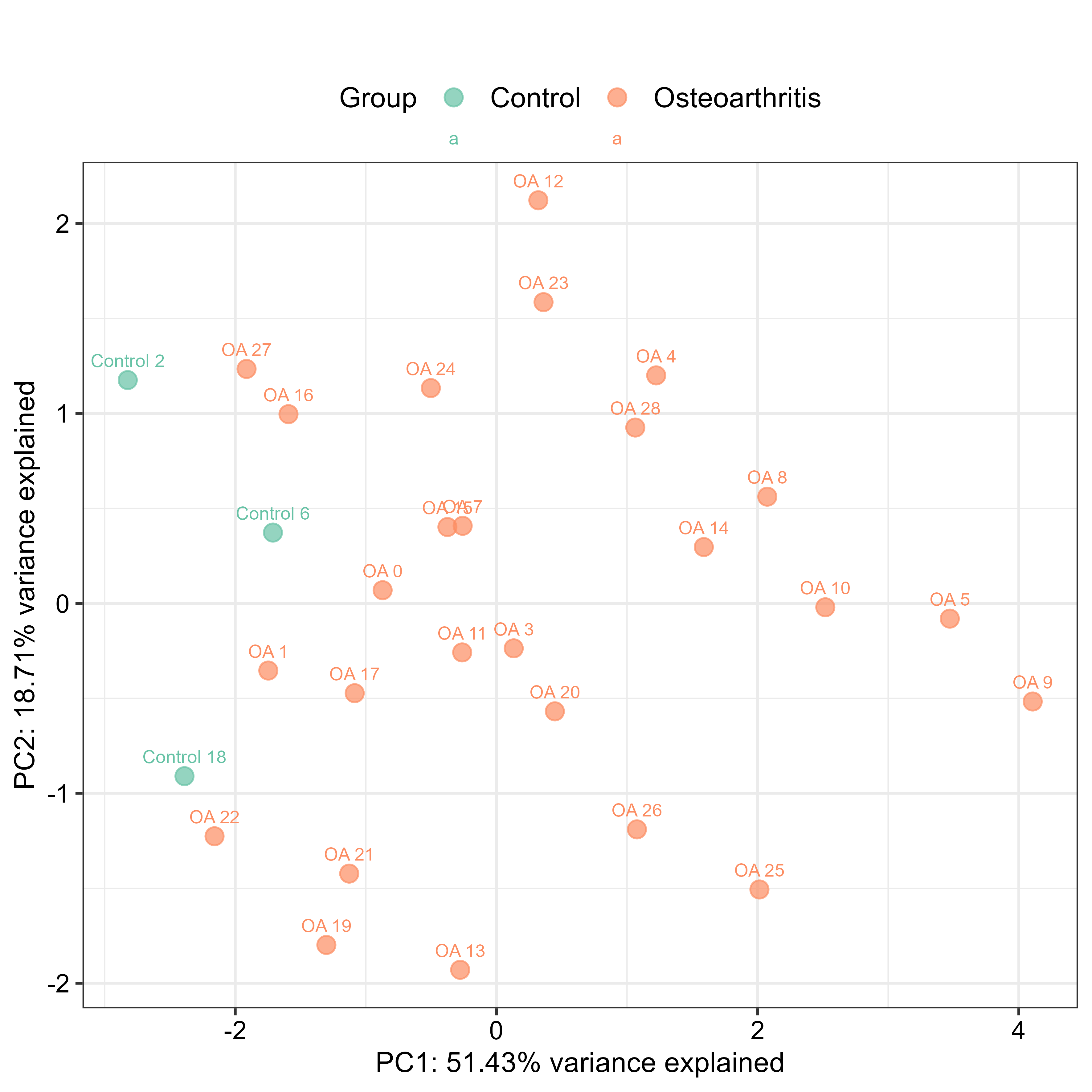
I then generated more QC plots using the normalised ddCt data - Boxplots, to visualise the distribution of ΔCt values per sample and per gene, grouped by condition (control vs osteoarhtritis), Cluster Analysis, to see how samples and genes group based on their ΔCt profiles, and PCA Plots, to visualise sample relationships in reduced dimensionality. The small data set didn’t let us get much information out of these plots, however.
1
2
3
4
5
6
7
8
9
10
11
# boxplot of dCt values by gene, grouped by condition
control_boxplot_gene(data = data.dCt,
                     by.group = TRUE,
                     y.axis.title = "dCt",
                     save.to.tiff = TRUE)

# PCA plot for samples based on dCt values
control_pca_sample(data = data.dCt, # Using dCt data for PCA
                   point.size = 3,
                   legend.position = "top",
                   save.to.tiff = TRUE)
📏 Relative quantification (ddCt) and results visualisation
Finally, I performed the relative quantification using the ddCt method to compare gene expression in osteoarthritis samples versus the control group average.
1
2
3
4
5
6
library(coin) # statistical tests used within RQ_ddCt

results.ddCt <- RQ_ddCt(data = data.dCt,
                        group.study = "Osteoarthritis",
                        group.ref = "Control",
                        do.tests = TRUE)
And then comes the results visualisation, starting with the Fold change plot (FCh_plot). This shows the fold changes for each gene, often with statistical significance indicated. I used p < 0.05 and Fold Change > 2 as thresholds for notable changes, following the instructions found on the CRAN website.
1
2
3
4
5
6
7
8
# defines significance labels for plots
signif.labels <- c("****", "***", "**", "ns.", " ns. ", "  ns.")

FCh.plot <- FCh_plot(data = results.ddCt,
                         use.p = TRUE, p.threshold = 0.05,
                         use.FCh = TRUE, FCh.threshold = 2,
                         signif.show = TRUE, signif.labels = signif.labels,
                         angle = 20, save.to.tiff = TRUE)
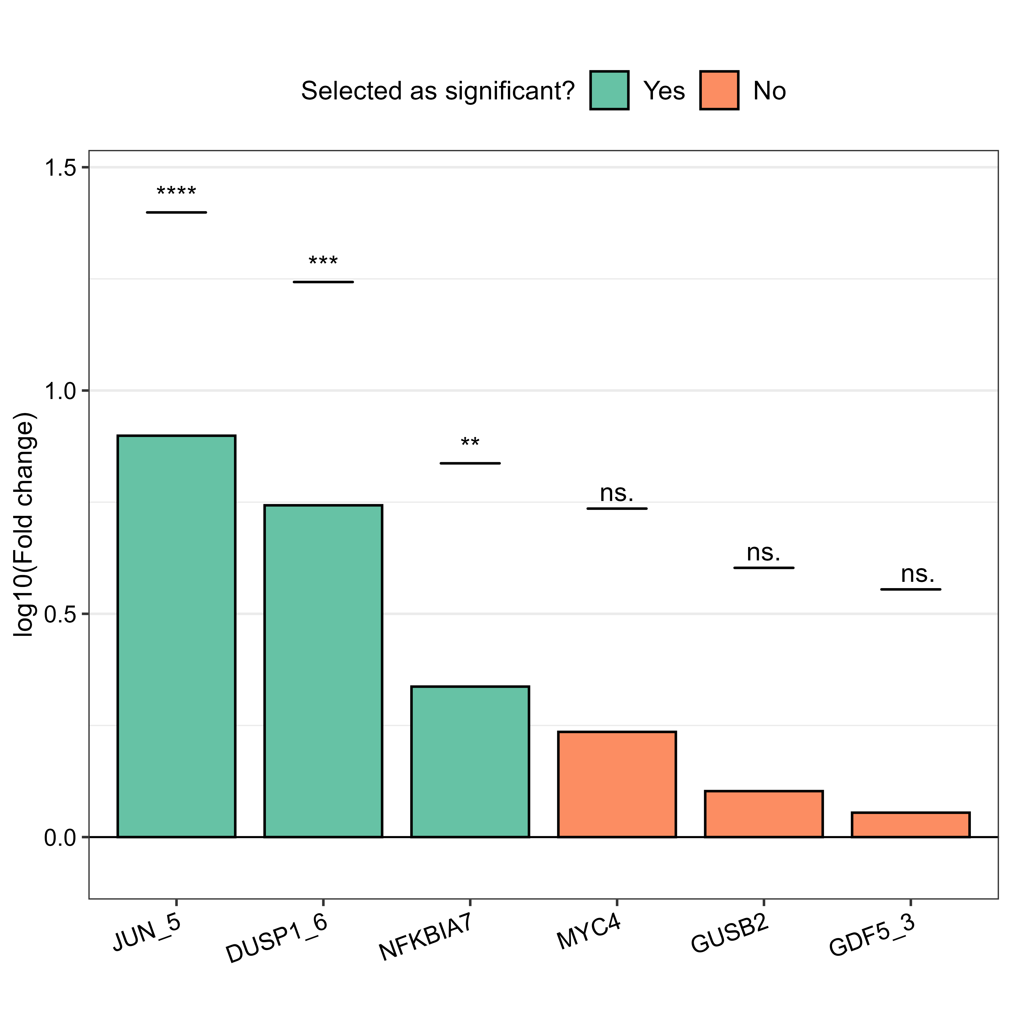 Fold change plot
I used Boxplots (results_boxplot) for the genes found to have higher significance (JUN_5, DUSP1_6, NFKBIA7) in the Fch plot, in order to visualise their expression levels and significance between groups. I made both faceted and non-faceted versions but chose the faceted one in the end.
1
2
3
4
5
6
7
8
9
10
11
12
13
14
# faceted boxplot for the selected genes
final_boxplot <- results_boxplot(data = data.dCt,
                                 sel.Gene = c("JUN_5", "DUSP1_6", "NFKBIA7"),
                                 by.group = TRUE,
                                 signif.show = TRUE,
                                 signif.labels = c("****","***","**"),
                                 signif.dist = 1.05,
                                 faceting = TRUE,
                                 facet.row = 1,
                                 facet.col = 4,
                                 y.exp.up = 0.1,
                                 angle = 20,
                                 y.axis.title = "dCt",
                         	  save.to.tiff = TRUE)
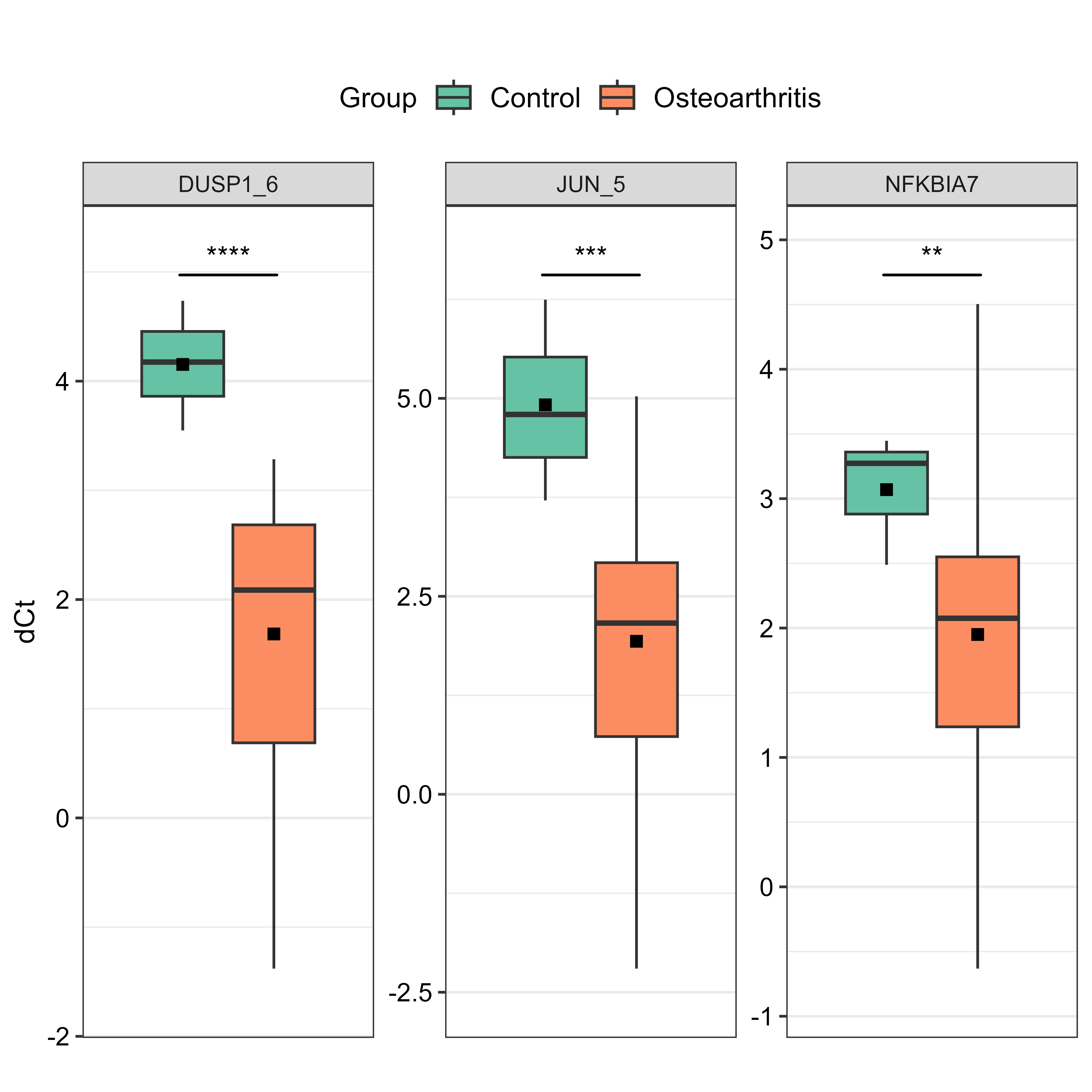 Faceted boxplot
The heatmap (results_heatmap) provides an overview of expression patterns across all genes and samples using the normalised ΔCt data, with custom colors for groups and expression levels.
1
2
3
4
5
6
7
8
9
10
11
colors.for.groups = list("Group" = c("Osteoarthritis"="firebrick1","Control"="green3"))
colors_gradient <- c("navy","navy","#313695","#4575B4","#74ADD1","#ABD9E9",
                       "#E0F3F8","#FFFFBF","#FEE090","#FDAE61","#F46D43",
                       "#D73027","#C32B23","#A50026","#8B0000")

results_heatmap <- results_heatmap(data.dCt,
                                       sel.Gene = "all",
                                       col.groups = colors.for.groups,
                                       colors = colors_gradient,
                                       show.colnames = FALSE,
                                       save.to.tiff = TRUE)
 Heatmap
Last but not least, single gene-pair scatter plots (single_pair_gene, single_pair_sample) and other sample and gene correlation plots (corr_sample, corr_gene) used for the analysis and visualisation of relationships between pair of samples and genes.
1
2
3
4
5
6
7
8
9
# example of single pair sample scatter plot comparing a osteoarthritis sample against a control sample
OA1_Control18 <- single_pair_sample(data = data.dCt,
                                     x = "OA 1",
                                     y = "Control 18",
                                     point.size = 3,
                                     labels = TRUE,
                                     label = c("eq", "R2", "p"),
                                     label.position.x = 0.05,
save.to.tiff = TRUE)
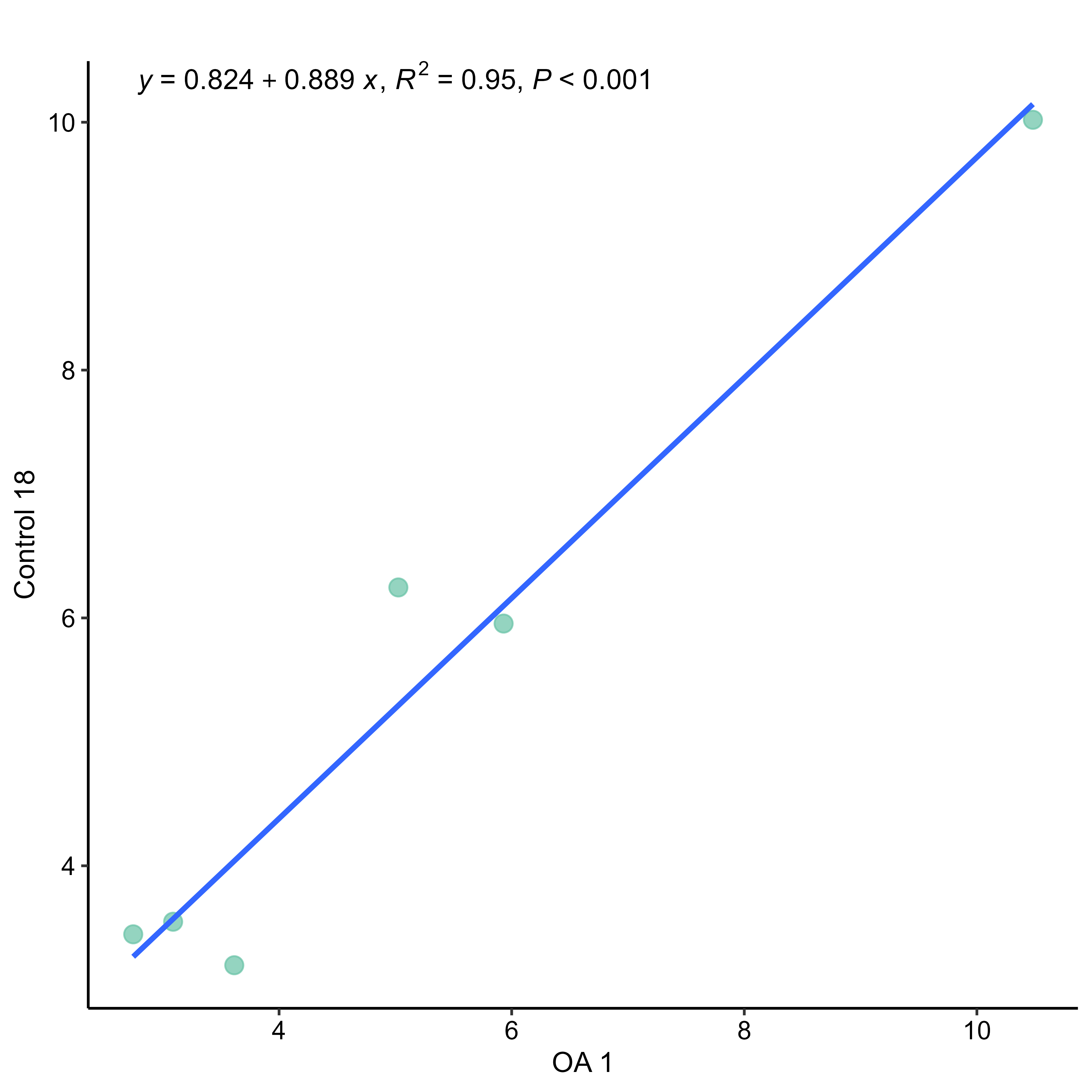 Single pair sample scatter plot example
😁 Good fun this was!
Helping out with this osteoarthritis project was a great exercise for qPCR data analysis using R. The RQdeltaCT package proved to be quite comprehensive, offering a suite of functions that cover the workflow from raw Ct data loading and QC, through reference gene selection and normalisation, to relative quantification and a variety of publication-ready visualisations. While every dataset has its quirks (like our initial heatmap hiccup), having dedicated tools like this makes the process much smoother and the exploration of gene expression data really enjoyable. The ability to quickly generate insightful plots is fantastic for understanding the story your data is trying to tell.